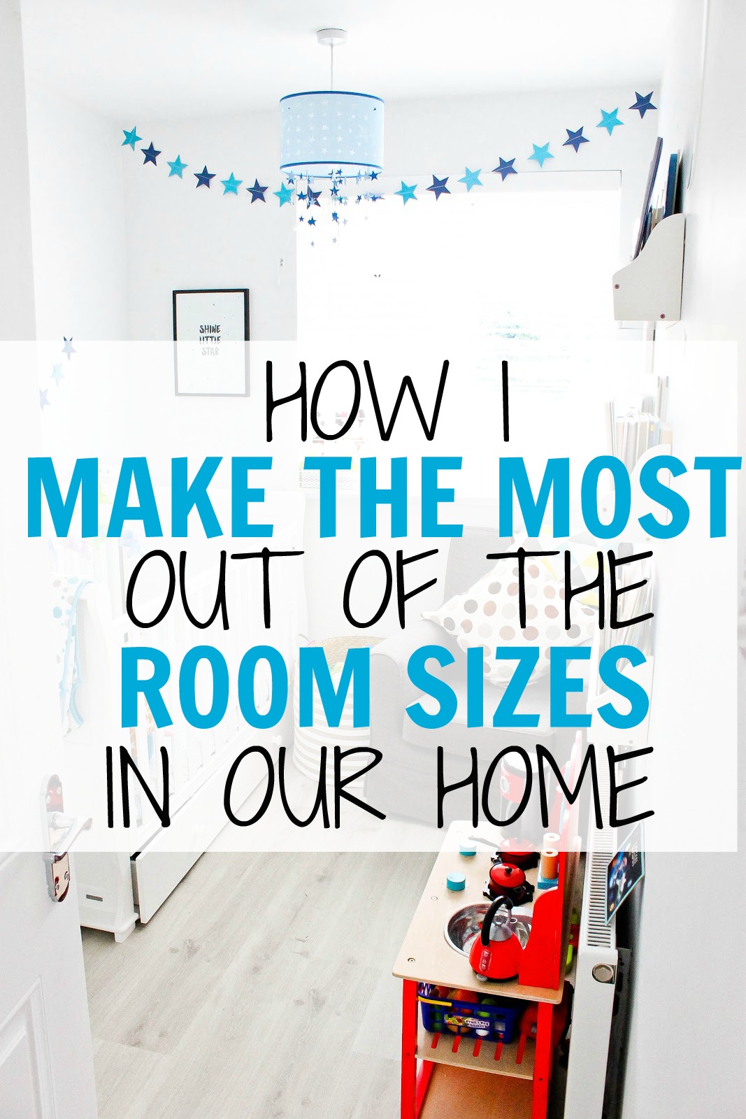
When it came to redecorating our bedrooms last year, I knew we had to make careful decisions with the decor that we chose and the accessories and furniture that we used. Our house is a nice size for us, but it isn't large and there's not a great deal of storage so we really wanted to make the best use of the space that we had.
Adam and I are big fans of the minimal modern sort of look, though it's not a decor look that is always possible with young children. So with that in mind, we decided to try and make our rooms appear as big as we possibly could. We decided to repaint each of the rooms an off-white colour and pull up the carpets and replace them with a light laminate. We felt by doing that, that the rooms all felt more unified looking in from our landing and that the off-white paint and light grey flooring made the rooms feel far more open than they had previously. We personally generally find that with smaller rooms, the darker they are, the smaller they seem.
Because we decided not to use different paint colours in each room we decided to give them personality via the decor and furniture that we chose. For Ethan's room, we went for a more grown up plane-themed bedroom, for Logan we went with a blue star nursery sort of feel.
For our new office which was previously our bedroom, we went quite Scandinavian and used a lot of white furniture to contrast with our black iMacs, the printer and our office chairs.


And for our new bedroom up in our new loft conversion we went for a 'sanctuary' sort of feel that was minimal, bright and modern. We bought a big mirrored wardrobe from IKEA that holds tons of our clothes but also makes the room feel slightly larger due to the huge mirrors on the front.

Our roof windows (similar centre pivot here: roofwindows.co.uk) are our absolute favourite things in our conversion (they're actually probably one of my most favourite parts of our house), they let so much light in and they make the room feel airy and open.

Asides from re-painting, laying new flooring and picking themes, we decided to make the best use of the walls and the height in our rooms. One of my favourite ways to do this was by using IKEA pictures ledges (available here), because they're great for holding trinkets, displaying frames like the ones we have above our bed and also for displaying the kids' books (forward-facing of course).

In terms of prints and frames for the walls, our favourite place to get them from is Desenio.co.uk - they have amazing prints and their frames are really good quality. To go with the boys' room themes we decided to get them a bunting each for across their blinds. Ethan's was a plane bunting and Logan's is a star. We decided to do this because we went with white blinds again for unity across the top of the house (I say top as we haven't yet done the bottom half). Obviously, as with all cords, the cords on our blinds have been put right up out of the way so that our boys can't reach them.


And lastly, we decided to try and buy semi-matching furniture just so that the rooms didn't look mismatched. We can't fit a lot of furniture into Logan's current room as it's the smallest room in our house, but he has a little chest of drawers in there, his cot and a small wardrobe as well as an IKEA armchair. Inside the chest of drawers, we use SKUBB boxes (again from IKEA - we seem to buy from there a lot for our home!), which helps us to organise Logan's clothes a bit neater whilst using the full space inside each drawer.

It's been about a year now since we finished redecorating the top of our house and we're still so pleased with how the rooms look, how we used the space and how we decorated them. We feel like we did our best to make the most of their sizes.
What's your favourite room in your house? And what's your number one decorating/decor tip?
Thanks for reading. Alex xo
I am still in the middle of decorating the rooms. The kids rooms are pretty much finished. I just have to get one or two more things for our maritime themed bedroom.
ReplyDeleteI recently found, because we have concrete walls, hammering a nail into the wall can be a hit and miss.
Now I am using the stripes you can apply to the wall and then stick the hook on. I am applying a little bit of super glue. It's brilliant. Means pictures never fall down and no hole in it if I decided to replace them.